
Monday, August 30, 2010
Sunday, August 15, 2010


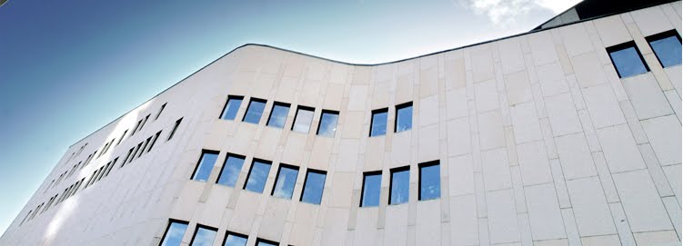
Final Presentation

Structure - Circulation - Void - Mass Diagram

Hierachy of Program ( Yellow - Most Public, Red - Private )

Thursday, June 10, 2010
Comments by Michael Leocata – Cody Studio : Final Jury May’10
Rob,
Here you go. Sorry it took so long.
Mike
Comments by Michael Leocata – Cody Studio : Final Jury May’10
Studio:
In all, really nice work. The effort to create a solid and stylized presentation was appreciated and successful. More importantly, I thought the progression from where the projects were (from my last visit) to the direction shown - was very good. This phase of work, in my opinion – is a much more difficult process than the concept work I reviewed last time.
There were some general items that would make the techniques of the presentations stronger... Just some suggestions:
v Bring study models and sketches which bolster your thesis
v When describing your design process. Don’t use words such as, “I was playing around with this….” Rather, present your work with, “I was investigating…” Architecture is a rigorous analysis, so don’t cheapen your approach with wrong word choice.
v Look out for misspellings on your drawings. I saw the word “SEXTION” on one, I don’t know if that was a Freudian play on words, but once again – double check.
v Time management – the final model is a trap. Be sure that in every model made, (be it the final white strathmoor board or the initial gesture chipboard study) is an excuse to make/manipulate space. If the model is to fulfill a requirement, it will more than likely be unsuccessful.
Projects:
Brian: Hawaii
The colored plans were nicely drawn, but your final model was not as powerful as your earlier studies, culminating with the rear retaining wall (cistern) which was architecturally unsuccessful.
Stacy: Holistic Long Island Community Center
Dennis: NJ Community Center and School – In my opinion, your project not only became successful, but became architecture. Previously your project evolved from three disparate buildings in a field to an integrated amalgam that created its own archetype. Perhaps the portalled façade was a bit too funky for some, I appreciated its playfulness – especially in its skin for a school. Your drawings and model were very well constructed and what I thought was most successful was your investigation of the project in section. To emerge from the ground to the entry is a powerful way to approach the site. Good work.
Matt: Farmer’s Education Center
Nik: Malta Symposium Center
Derek: Roosevelt Island Recovery – Amazing possibilities abound. This project is sweeping and broad with many tensioned poetic dichotomies. The introduction of the water elements and amphitheatre breaks down the scale and creates potential moments of intimate reflection….awesome. I suggested the potential sectional interplay between the water elements to create motion and sound. Perhaps that can assist in connection/procession between programmatic elements.
What was curious to me was handling the new form-making against the backdrop and within the hallowed existing ruins. Unfortunately, you didn’t get that far. I suggested you look at the First Unitarian Church in Louisville , KY
Stephen: Closter Reservoir Rehabilitation – I understood the direction that you took for developing your archtitecture and thesis, but I personally disagreed with your approach. The original scheme had a chapel and several moments that made places within the landscape. When the project abstracted to basically two building forms with the organizing central court to bind the project – I felt it lost something. The buildings in my opinion were sited too far away from each other to create a dialog or tension. It just needed some more time to congeal. This can be taken further especially after the professor gave you a great idea for simplifying the entry sequence.
Jenn: Market – I felt your project was tough to develop because a major component was creating flexibility – thus, all needed to be open and clear – and when you did take a stand and create the mini-module-pod pieces to the idea – it seemed forced or unsupportive to your overall idea. I suggested the use of color and the rooftop form to be more delicate in section as investigated in your 1:50 scale chipboard model… It is a tough project to critique because its power is when the exhibits/people inhabit it and create the richness within your shell.
Once again, thank you all for having me.
Michael Leocata
Architect
Tuesday, June 1, 2010


Monday, May 31, 2010
Matt- Final Model


I was able to take some outside photographs of my final model playing with sun and shadows.
Thursday, May 20, 2010


Wednesday, May 19, 2010


Tuesday, May 18, 2010


Sunday, May 16, 2010
Review Order
Unless somthing changes tomorrow, this is the order.
Pin-up at Noon in room 134. I'll be in around 11am.
Matt
Brian
Stacy
Dennis
Jenn
Nik
Steven
Derek
Pin-up at Noon in room 134. I'll be in around 11am.
Matt
Brian
Stacy
Dennis
Jenn
Nik
Steven
Derek
Friday, May 14, 2010
Thursday, May 13, 2010
Elevation FINALLY corrected

Here is the Western Elevation, added some shadows and I think it did alot as far as adding some depth. The drawing was way too flat previously. Let me know what you think. Tried to use the people to highlight the more public area's rather than labeling it....which i'm really trying to avoid doing.
Site Plan Revised
.jpg)
Final Changes that I made to the site before cutting my topo's. Theres a new retaining wall toward the south that follows the edge of the amphitheatre. It had to be created in order to accuratly make a connection between the surface above the gym and the area on the right. Took me a long time to fix all my topographical disasters i created. No more " -10, 0, 10, and 20. The real topo's are 2 , 12, 22, and 32. The water is 2 feet below land around the whole site.

Wednesday, May 12, 2010
Nik - Elevation Adjusted
 Just adjusted my elevation. I think its looking good. I got to adjust the plans accordingly now since this will change the overall layout of the top 2 floors for the theatre.
Subscribe to:
Posts (Atom)